-
 United Kingdom
- Sign in
United Kingdom
Updated: 22 October 2024
Since we started in 2010, we’ve helped over 103,000 UK businesses borrow £13.6 billion to grow – and in that time, Funding Circle has grown up too. We’ve evolved from a peer-to-peer lender, to the UK’s leading platform for business finance, backing SMEs with the finance they need in the form of business loans, asset finance, business credit cards and flexible lines of credit.
Our business has changed and grown to better serve our customers. So we needed a new brand that reflected that…
We’re more than just money. We’re passionate about helping you access the finance you need to succeed, but also offering the experience, education and information to reach your goals. We know how difficult running a business is, and we may not be able to make switching off any easier. But we’re proud to be the team of experts that, whenever you’re thinking about your next step, has got your back.
Our new tagline represents the rallying, dynamic business we are today.
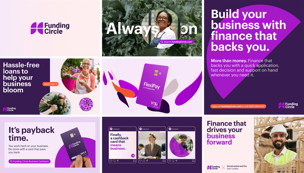
While we were busy building amazing new products for our customers, our visual identity needed a facelift. Our colour palette lacked focus and vibrancy, and our typeface felt a little too serious. It was time for a change.
Our new look is warm, human and built around bright bursts of colour – filled with the same optimism and energy we strive to bring to small business owners every day.
Purple has been our signature colour since day one, but as other colours started to creep in over time, we felt it was time to return to our roots. We’ve turned up the brightness on our brand purple, landing on a warm, vibrant hue that feels distinctive and exciting.
To complement it, we’ve built a supporting palette of soft pastels, gradients, and contrasting dark tones that put our purple and coral accents in the spotlight.
When it came to our hero typeface, we wanted something that could carry our message clearly but still have a bit of personality. That’s why we chose Graphik. It’s bold, geometric, yet straightforward – just what we needed to help our words speak for themselves.
And for everything else? Inter was the natural choice. It’s clean, accessible, and ensures that everything is always crystal clear, from website pages to marketing letters.
Small businesses are at the heart of every single thing we do. We wanted our photography style to reflect the passion and drive of small business owners – but we wanted it to feel authentic, like we’re right there with you, without being in the way. The candid shots focus on our inspiring customers, and on the little details and textures that make every business unique.
We know that running a business never really stops, and every part of our new visual identity reflects that ongoing energy. We’re now working on rolling it out across everything we do – from our brand new mobile app, to our case study stories which reflect the incredible impact of small businesses around the UK.
We’re so excited about this new era for Funding Circle, and we hope you are too. Here’s to a new brand that matches the energy of the amazing business owners that we support. A big thank you to Re Worldwide and Studio Certain for helping us make it all happen.

5779 REVIEWS


